


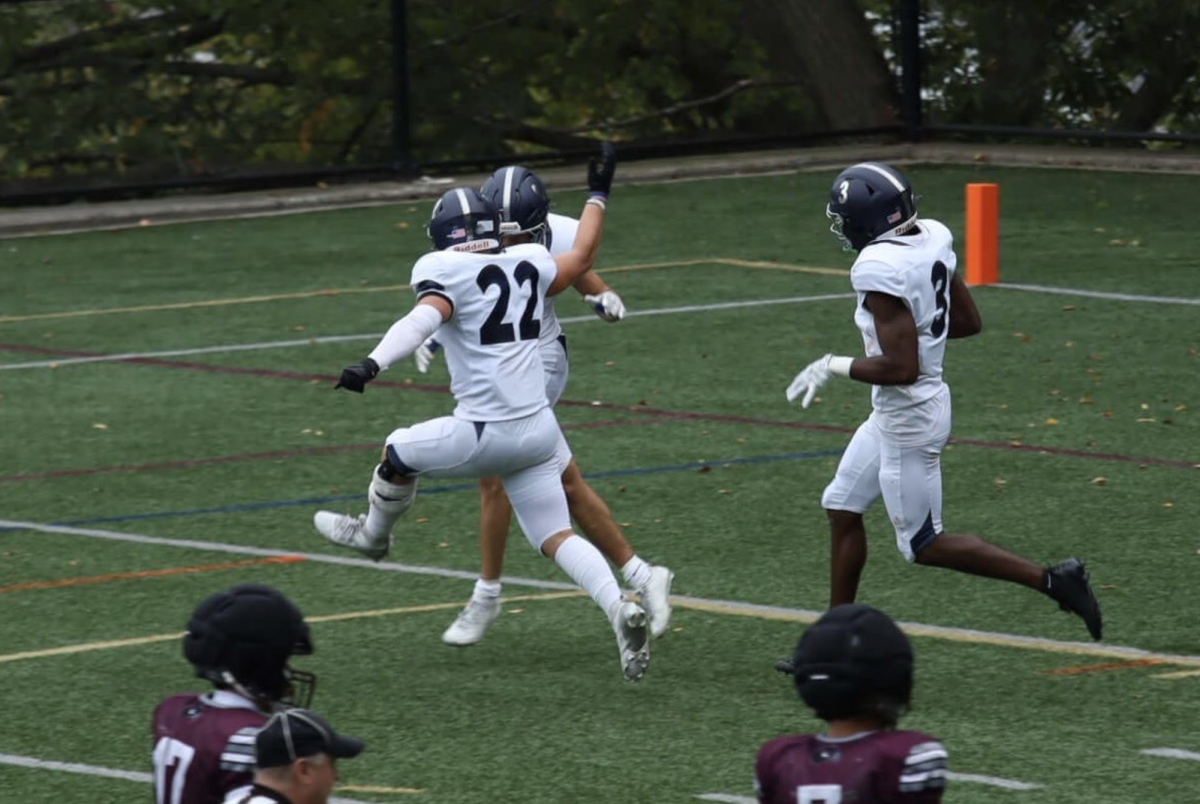
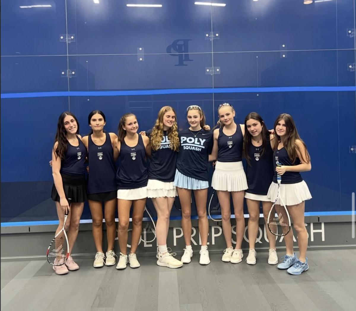

Poly Blue Devil Logo Gets Makeover After Five Decades
VIA KEN NIIMURA
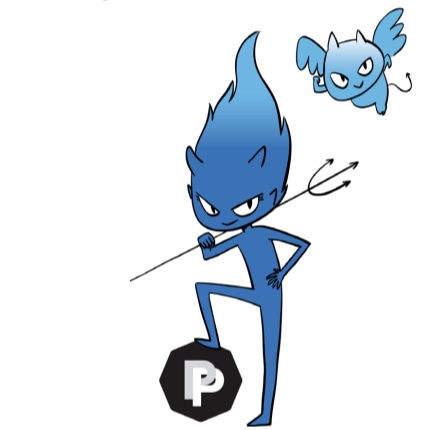
After over 50 years, Poly Prep’s Blue Devil logo finally got a makeover. Right before Homecoming in October, the new design was released to the Poly community, resulting in many mixed reactions. Jennifer Slomack, Director of Engagement and Communications, explained that the original design for the Blue Devil was created by a student in the late 1960s. “The artist would not have considered Poly women or seven Poly Lower School grades—which is more than half of today’s student body—into the design process,” she said. The main focus was a new design that included all students at Poly, and was able to showcase all activities, not just athletics.
Poly originally looked at the portfolios of 12 different artists that could potentially design the new logo. “We pared down the list to three illustrators whom we felt had the range to do both characters. After discussions with them about the project, our school, and their work process, we thought Ken [Niimura] was the best choice to bring our vision to life,” Slomack explained.
Spanish-Japanese comic illustrator Ken Niimura was hired to create the new logo. In 2008, he illustrated the book I Kill Giants, which was adapted into a film in 2019. Niimura has worked with several companies, including Amazon, Google, and Marvel Comics.
After being chosen by Poly, Niimura said he was excited to create the new Blue Devil logo, designing it with a focus on how the students would feel about it. “In each new sketch and step, I was constantly asking myself whether they’d like it or not, and also if I’d like it myself had I been a student in the school,” Niimurae explained to Poly’s website.
When the new Blue Devil was introduced, students had many different opinions and reactions to the design. Some said they wished that the logo resembled a devil slightly more, as the new design is very simple and does not include a tail like the old logo does, while others said they believe that it’s not “threatening enough” when it comes to playing against sports teams from rival schools. “The logo seems like something out of a children’s book, not an intimidating mascot our school should be rallying around,” said senior Ella Leonard.
By comparison, senior Hannah Smith really enjoys the new Blue Devil look, emphasizing that she feels it is definitely an upgrade from the old design. “I like the new logo how it is, and especially love how it has the little sidekick with it. Overall, I think it’s really adorable and an improvement from the old one,” Smith said. Slomack has heard a wide variety of opinions about the new logo, understanding that it may be hard for students to adjust to the change. “I’m looking forward to hearing what students think after they’ve had time with the new designs, use them, and see them around campus,” she said.

Samantha Rodino '22 is a Sports Editor for the Polygon. She joined the Polygon in her freshman year and became the Arts Editor in her junior year. She...